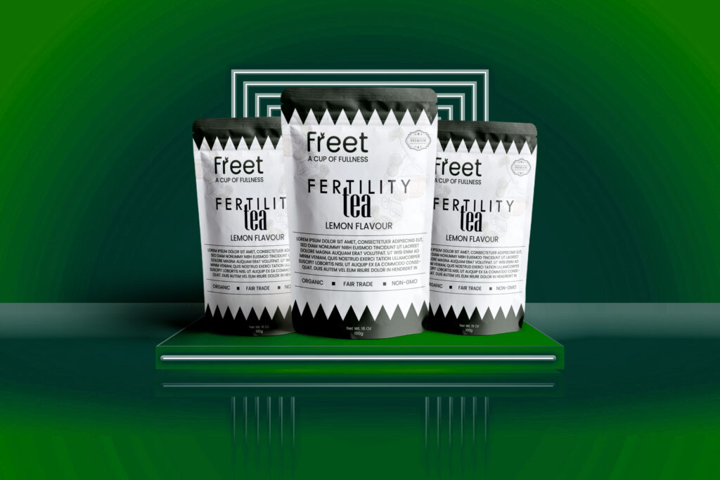
Freet Fertility Tea Pouch Design
Crafted to connect health, trust, and minimal aesthetics. This premium packaging design for a fertility tea blend showcases clarity, shelf appeal, and modern wellness branding.
Premium pouch packaging design for Freet Fertility Tea (Lemon Flavour) by WebDev Habib. Clean, organic, modern design for wellness products and herbal tea packaging.
🔍 Project Overview:
Client: Conceptual (Portfolio Showcase)
Product Type: Organic Fertility Tea (Lemon Flavour)
Packaging Type: Stand-Up Pouch (100g)
Style: Modern · Clean · Trustworthy · Organic
Software Used: Adobe Illustrator, Photoshop
🎨 Design Objective:
The goal was to create a clean and minimal pouch design for a fictional wellness tea brand that communicates organic health support in a professional and modern style. The design is tailored for shelf visibility and customer trust, suitable for both retail and online stores.
🧠 Design Strategy & Thought Process:
Understanding the Product:
A tea that supports fertility health needs a gentle, trustworthy, and premium brand image. We avoided loud colors and leaned into minimalism and clarity.Typography Focus:
A modern sans-serif typeface was used to convey both scientific credibility and elegance. The word “Fertility” is broken into clean sections to make it memorable.Color & Visual Theme:
A black-and-white pouch keeps the look premium and pure, while the green background evokes nature and well-being — visually connecting with the tea’s organic roots.Icons & Certifications:
Important labels like “Organic,” “Fair Trade,” and “Non-GMO” are prominently displayed to immediately reassure consumers of product quality
💬 Conceptual Feedback:
“This design gives off premium, clinical, and clean vibes — exactly the kind of packaging that builds consumer trust. The contrast and simplicity are on point.”